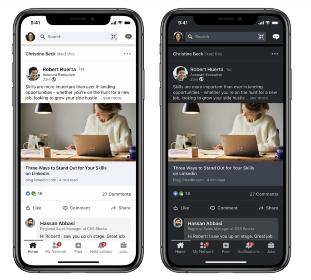
LinkedIn recently announced that users will be able to switch to dark mode on mobile. Dark mode, which has already been implemented by other companies including Google, will allow users to switch their preferences with a more relaxing night-time interface. Dark mode reduces the amount of light given off by electronic devices while maintaining the color contrast ratios to keep everything on a website legible. Web Content Accessibility Guidelines (WCAG) offers the framework for why platforms like LinkedIn are making the change. As awareness grows towards web content accessibility and inclusion for those with disabilities, color contrasts are being defined with light and dark modes being enabled to offer greater inclusivity.
There are compelling reasons to offer this new feature. Enabling dark mode is better for low-light settings with less ‘blue light’ being emitted. You’ll likely see your phone battery lasting for longer and if you’ve had issues with light sensitivity or visual impairment, dark mode will likely be your preferred setting. Companies like Spotify have embraced the look as a primary setting for their apps. Others are not embracing the new look. There’s conflicting science around whether reading on a dark background significantly reduces eye strain. It comes down to preference with some users liking the more modern appeal.
Image source: https://www.socialmediatoday.com/news/linkedin-launches-dark-mode-on-mobile-and-desktop/606485/
For some brands dark mode may not necessarily be a welcome new feature. Company logos are typically designed keeping a white background in mind so dark mode may not be as complimentary to the brand. For your LinkedIn company profile, keep in mind the following:
- Is your logo presented on a white or dark background? If you’re using a muted grey, for example, your logo will not stand out as much as when you’re using a logo on a white background.
- Do your brand colors offer a high contrast value in dark mode? For example, do your brand colors appear brighter on a dark background compared to light?
- If your brand colors appear muted, do you have a secondary color palette that offers better contrast? Standing out in light mode is sometimes easier for brands compared to dark.
If you’re on the fence about LinkedIn’s new dark mode, give it a try on mobile. Tap on your headshot and preview your Settings. Your ‘Account Preferences’ tab will give you the option to switch between light and dark mode. If you’re not a fan you can easily switch back. Each LinkedIn user can choose his or her own account preferences so your choice will not affect the look and feel on someone else’s app.


